AMR/AMU KAP+ EXCEL TOOL HANDBOOK
Glova, N., & Villacastin, J.N.
Department of Humanities
University of the Philippines Mindanao
20 December 2020
About this version
- this is for the v2.1-beta versions of the Excel tool
- all data shown are dummy data
Important Links
tl;dr
What is this tool for?
- The KAP+ Excel Tool is meant for easy data encoding, cleaning, and exploratory analysis of data collected for the “Enhanced assessment of knowledge, attitudes and practices; and, intervention (KAP+) on antimicrobial resistance and antimicrobial use among veterinarians” research project of the Food and Agriculture Organization (FAO).
Can I add new observations in the raw_data table?
- Yes, the tool can be updated with new observations; some function dragging is required to update coded and processed data sheets. Moreover, there is no limit as to how many observations can be added as long as your version of Excel can handle the number of observations.
Do I need to tweak the KAP+ Excel Tool’s functions to update other tables?
- No, raw data is automatically coded and processed based on the coding scheme in the KAP+ survey sheets. You just need to drag some cell functions in the coded_data and processed_data sheets.
Can I copy the data in the tool into other spreadsheet formats?
- Yes, data table sheets in the tool are designed to be easily copied and exported into .csv files for more robust statistical and computational analyses. However, you will have to copy the data sheets you want to use manually (Please see tutorial below).
Introduction
This is a tutorial guide for the AMU/AMR KAP+ Excel Tool, which is designed to accompany surveyors in the field.
The tool is designed for light exploratory data analysis, but its data tables are designed to be compatible (and efficient) with more robust statistical programming languages/software such as SPSS, SQL, R etc.
However, the naming conventions are optimized for data wrangling in the “tidyverse” R package.
How does the KAP+ Excel Tool work?
In a nutshell, the KAP+ Excel Tool automatically codes, processes, and analyzes raw data. Survey data is manually inputted with the corresponding codebook answers in the raw_data sheet.
Data in the raw_data sheet are automatically coded into their corresponding numerical codes in the coded_data sheet.
Coded data is summarized both as individual items in the survey_answers sheet and as variables in the processed_data sheet.
The variable scores in the latter are further processed into parameters in the summary sheet and tested for significant correlations in the correlations sheet.
Fig. 1. Diagram showing how data is coded, processed, and analyzed in the Excel tool

The KAP+ Excel Tool is a handy companion for the encoding, processing, and exploratory analysis of data from the KAP+ Questionnaire. For a short introduction to the questionnaire, you may refer to the following video:
Parts of the Excel Tool
The Excel Tool contains the following parts:
- The intro sheet which contains metadata and links to the codebook, survey sheets, and GitHub repository;
- Data Table sheets composed of the raw_data and coded_data sheets. These contain data tables/frames in string and code data respectively and can be exported into .csv files for more robust data analysis; and
- Data Summary sheets composed of the processed_data, survey_answers, summary, and correlation sheets; contains exploratory data analyses of the data in the data table sheets.
For a short tour, please watch the following video:
Getting around the intro sheet
Before using the Excel tool to input data or do some analysis, the first sheet you are going to see is the intro sheet. Make sure to check the links in the sheet and fill up the metadata portions.
A. Metadata
When compiling all the survey data after the survey period, we will be creating an online database (preferably in a cloud-based SQL server) to keep all the data for more robust analyses and meta-analyses. That is why metadata information will be very important. You can input your metadata in the survey information box like the one shown below.
Fig. 2. survey information box. Sample size automatically updates upon entering ID numbers in the raw_data sheet.

B. Links to documents and GitHub repository
The Excel tool requires that you have a copy of the codebook companion for the raw_data sheet and the survey sheets themselves. You can download them in the related documents box as shown below.
Fig. 3. Links to related documents.
Moreover, to check the latest updates of the Excel tool, some demo analyses with R, and other necessary files, you can access them in the GitHub repository as shown below.

Fig. 4. Link to the GitHub repository.

C. Links to the Excel tool sheets
You can automatically access the data table sheets and the summary sheets by clicking on the hyperlinks in the results box as shown below.
Fig. 5. Links to the different sheets in the Excel tool .

In the following chapters, we will be exploring the different layouts and functions of each sheet.
Chapter 1. Data Table Sheet Layout
The KAP+ Excel Tool contains two data tables:
- raw_data which contains strings (text) data,
- coded_data which codes the string data in raw_data into numeric data, and
Although processed_data summarizes data into variable scores, we can also think of this sheet as a proper data table in the sense that it contains individual respondent scores per variable. So we can also treat it as a data table:
- processed_data which groups the codes in the coded_data by variable and takes the variable scores.
You can access the sheets either through clicking the links in the Results box in the intro sheet, or click the tabs found in the bottom part of the Excel interface. The summary sheets can be accessed in the same manner.
Fig. 6. Sheet tabs found in the bottom part of the Excel interface.

The data table layout is divided into two parts: the indicator rows at the first three rows, and the observation rows which start from the fourth row and end depending on the sample size.
Fig. 7. The data table layout. Indicator rows are in rows 1 to 3 while observation rows are in rows 4 and beyond.

Indicator Rows
The indicator rows show the variable category row in row 1, variable row in row 2, and item row in row 3
The item row is also called the header row as it is usually used as the first row when data is exported into a .csv files
Fig. 8. Indicator row. Row 3 is the header row.

A. Variable category row (Row 1)
Variable category rows indicate which part of the survey a group of columns belong to.
The survey is divided into four or five main parts. Each part is uniformly color-coded in all iterations of the Excel tool for easy identification.
Fig. 9. Color-coding scheme for the survey parts. This color scheme is used consistently throughout the Excel tool.[^2]
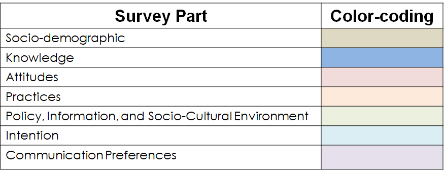
Each survey part is abbreviated as such:
| Survey part | Abbreviation |
|---|---|
| Socio-demographic | SD |
| Knowledge | K |
| Attitudes | A |
| Practices | P |
| Policy, Information, and Socio-Cultural Environment | E |
| Intention | I |
| Communication Preferences | C |
B. Variable row (Row 2)
Variable rows indicate what variables a group of columns belong to. As we will see later in this tutorial, variable scores are computed in the *processed_data sheet by summing up the columns that belong to specific variable rows.
For example, in this image below, items k1-k3 are attributes of the “Knowledge on Antibiotics” variable.
Fig. 10. An example of a variable row, "Knowledge on antibiotics" in row 2. The columns corresponding to the variable’ cell are its attributes.

C. Item/Header Row (Row 3)
Item rows indicate the individual items of the survey. Each item row cell follows the naming convention:
#(surveypart|sd,k,a,p,s,i,c) + item no. + "_" + item description
for example:
k1_ab
(Knowledge item no. 1 on antibiotics)
“Knowledge about antibiotics”
Items which require multiple answers need to have a separate column per answer.
For example, take the following item which can have multiple answers:
Fig. 11. An example of an item which requires multiple answers.

This item has to be spread in the Excel sheet into multiple columns, with each possible answer having one column. Items with mutiple columns are usually named like this:
(Survey_part(sd,k,a,p,e,i,c) + item no. + lowercase letter + "_" + attribute
For example:
SD12a_location_flatland, SD12b_location_sloping, SD13c_location_nearwater etc.
These items are usually yes/no in nature (unless it calls for an open answer), and are usually inputted like so:
(
Fig. 12. An example of an item with multiple possible answers. Such items are spread into multiple columns with one column per possible answer.

Common Abbreviations
For the sake of brevity, common abbreviations are used all throughout the Excel tools. These include:
| abbreviation | meaning |
|---|---|
| ab | antibiotic |
| abr | antibiotic resistance |
| abu | antibiotic use |
| am | antimicrobial |
| amr | antimicrobial resistance |
| amu | antimicrobial use |
| sd | socio-demographic |
| k | knowledge |
| a | attitude |
| p | practices |
| e | policy, information, and socio-cultural environment |
| i | interest |
| c | communication preferences |
Observation rows
Observation rows contain the answers of the survey respondents.
Each row from rows 4 to n is called an observation. Observations are given a unique respondent ID number in the “ID” column in the leftmost part of the data table.
Fig. 13. The observation rows; Observations start at row 4 and are assigned with a unique ID number.

Chapter 2. Data Table Sheet Functions
The data table sheets contain different modes of the same data. This is useful especially when you plan to do a more robust analysis with a combination of raw, coded, and variable score data.
raw_data
Before encoding respondent answers in the raw_data sheet, refer to the codebook column in the KAP+ Questionnaire:
Fig. 14. A sample filled-out KAP+ questionnaire. Refer to the codebook when encoding respondents’ answers in raw_data.

Simply encode the set words/phrases in the codebook into the Excel Tool:
Fig. 15. Encoding respondents’ answers in raw_data.

Although the Excel tool is case-insensitive, we suggest that all cell inputs are written in lowercase for ease of reading and compatibility with different statistical software and/or programming languages.
coded_data
The coded_data sheet codes the answers in raw_data based on the codes assigned to the answer choices in both codebook and survey sheet.
The sheet works by using different Excel functions that recognize input from raw_data and codes them based on the function’s coded instructions. For example, yes-no questions are usually coded with the function:
=IF(raw_data!"Cell directory" = "yes", 1, 0)
This basically codes “yes” as “1” and anything else as “0”. This is also why you need to refer to the codebook when inputting data in the raw_data sheet as the tool might not recognize other inputs and thus produce the wrong code.
Fig. 16. Diagram showing how coded_data uses functions to code inputs from raw_data.

processed_data
As the coded_data sheet only codes individual items, there is a need to further process the coded data in order to get the variable scores. As seen earlier, variables in the tool are composed of a unique group of items.
Fig. 17. An example of a variable, "Knowledge on antibiotics".

The processed_data sheet does several computations to get the following variable scores:
- (raw) variable score
- respondent’s percentage of correct answers
- indices
- index rankings
The processed_data sheet takes the raw variable scores by adding the coded data values of the unique group of items that constitute a variable.
Fig. 18. Diagram showing how a variable score is computed.

The variable scores, however, may not be applicable for analysis yet (depending if the user opts to go for parametric, non-parametric, or machine learning techniques). So the variable scores are further processed into three different answer types:
- Ratio of the each respondent’s variable score over the perfect variable score (expressed in percentage); and
- The index of the ratio score in (1) and its corresponding ranking which is based on a quartile division of 100%:
| Index | Rank |
|---|---|
| r >= 80% | very high |
| r >= 60% | high |
| r >=40% | moderate |
| r >= 20% | low |
| r >= 0% | very low |
Fig. 19. Diagram showing how variable scores are further processed into ratios, indices, and rankings.

Chapter 3. Encoding and Updating the Data Table Sheets
The general workflow for encoding and updating data in the data table sheets consists of four steps:
- Gather filled-out KAP+ questionnaires
- Encode respondents’ answers in raw_data
- Grab and copy Excel functions in corresponding cells in coded_data
- Grab and copy Excel functions in corresponding cells in processed_data
The data summary sheets (i.e. survey_answers, summary, and correlation) will automatically update on their own.
For a short tutorial, please watch the following video:
Encoding data to raw_data
To encode new observations of survey answers in the raw_data sheet:
- Add the corresponding ID number of new observations in the first column,
- To encode answers, refer to the codebook for the specific words and phrases that are recognized by the tool. These words and phrases are mostly shortened versions of the answers in the survey sheets
Fig. 20. Inputting new observations (shown in red text).

Updating coded_data and processed_data
Updating the coded_data and processed_data sheets only requires you to drag the functions in previous cells down to the row number of your inputted data. So if you added data from rows 14 to 16 in raw_data, simply drag and drop the functions from row 14 down to 16 in both coded_data and processed_data. For example:
Fig. 21. Updating the coded_data and processed_data sheets through Excel’s drag-and-drop function (new observations shown in red text).

Special cases
Depending on the question, there might be special cases where the data encoder might need to encode special codes in the raw_data sheet. Please refer to the video tutorials to learn how to approach the following cases:
1. Encoding skipped questions
2. Encoding open-ended answers
Chapter 4. Summary Sheets Layout and Function
The summary sheets summarizations of the data tables and exploratory analyses. These sheets are automatically updated after updating the coded_data and processed_data sheets.
Moreover, with the exception of processed_data, the summary sheets cannot be imported into other statistical software.
For a quick tour of the summary sheets, please watch the following video:
survey_answers
The survey_answers sheet contain all the questions in the survey sheets and show the sample score, percentage of correct answers, indices, and rankings per item.
Each survey part has its own table/s. You can sort the values in the table by clicking the header buttons. This allows you to sort scores from highest to lowest and vice-versa.
Fig. 22. Example of a table in the survey_answers sheet. The GIF above shows how to sort values.

summary
The summary sheet calculates measures for central tendency and spread for each variable in the processed_data sheet.
It also calculates the raw sample score, percentage of correct scores, indices, and index ranking for each variable.
Variables are grouped into tables based on which part of the survey they belong to. The same color coding shown in Chapter 1 applies in the sheet.
Fig. 23. An example of the summary sheet

correlation
The correlation sheet measures significant correlations of variables from the processed_data. The tool uses the raw scores from the _score columns in calculating for the Pearson coefficient.
Correlation in Excel is tricky because it requires extra steps in order to get the p-values and determine if a correlation is significant.
To do this, we need to get the t-value of the correlation coefficient to get its p-value. The following diagram shows how we can do it in Excel.
Fig. 24. Diagram showing how to calculate the Pearson coefficients, t-values, and p-values in the Excel tool.
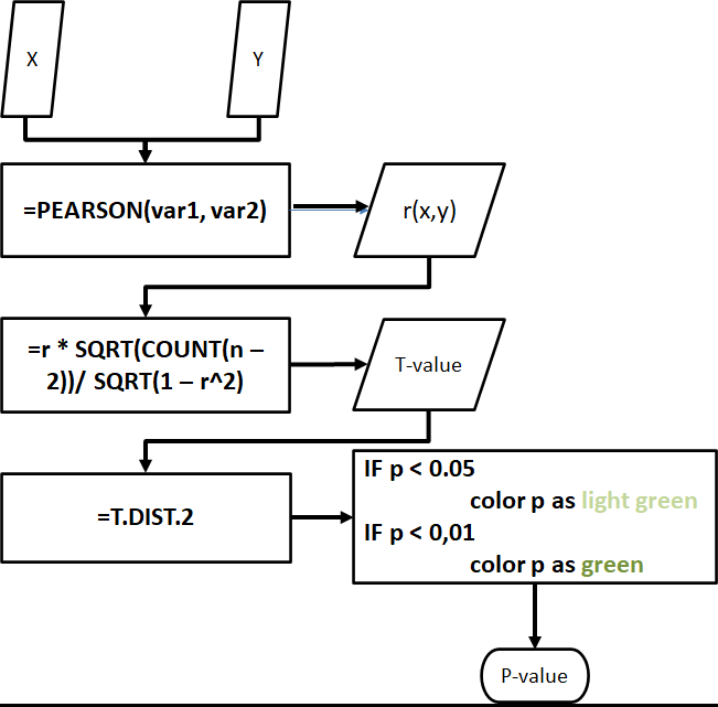
Fortunately, the Excel tool automatically computes the correlation coefficient, its t-value, and its p-value, and also flags if the p-value is significant at p < 0.05 and p < 0.01.
Figs. 25-27. Example of correlation tables in the Excel tool. The p-values are flagged with color highlights when found to be significant at p < 0.05 or p < 0.01.


Chapter 4. “Exporting” to .csv
Since the Excel tool can only handle a limited number of analyses, running more robust statistical analyses will require the user to import data from the Excel tool into a .csv file.
The easiest way to do this is to manually copy the data you need from the data tables starting from row 3 (item number in raw_data and coded_data, and variable name in processed_data) down to the last row of observations, and paste them in a new Excel file.
Fig. 28. Selecting the data to be copied into a new Excel file to be exported into .csv format. Row 3 is used as the data frame header.

The new Excel file can be saved in .csv format.
Fig. 29. A new Excel file with the data to be exported into .csv format.
